Visualization
In this documentation, we will provide a step-by-step guide on how to create and use visualization tasks.
[1]:
# %load_ext autoreload
# %autoreload 2
[2]:
import pandas as pd
import numpy as np
from matplotlib import pyplot as plt
# import plotly.io as pio
# pio.renderers.default = "svg"
[3]:
import warnings
warnings.filterwarnings('ignore')
warnings.simplefilter('ignore')
warnings.simplefilter('ignore', np.RankWarning)

import logging, sys
logging.disable(sys.maxsize)
Load Data
[4]:
try:
    from tsad.base.datasets import load_skab
except:
    import sys
    sys.path.append('../')
    from tsad.base.datasets import load_skab
[5]:
dataset = load_skab()
df = dataset.frame
df = df.reset_index(level=[0])
df = df[df['experiment']=='valve1/6']
df = df.drop(columns='experiment')
df.shape
[5]:
(1154, 10)
[6]:
#TODO use task in pipeline to resample dataframe
df = df.resample('1s').mean().ffill()
df.shape
[6]:
(1200, 10)
[7]:
features = dataset.feature_names
target = dataset.target_names[0]
Timeseries Visualization with VisualizationTimeseriesTask
The TimeseriesVisualizationTask class is designed to help you visualize time series data quickly and easily. It uses Plotly Express to create interactive line plots for one or more time series signals.
[8]:
try:
    from tsad.tasks.visualization import VisualizationTimeseriesTask
except:
    import sys
    sys.path.append('../')
    from tsad.tasks.visualization import VisualizationTimeseriesTask
The TimeseriesVisualizationTask class allows you to perform time series visualization. It includes the following attributes:
features(List[str] | None): A list of features to consider for visualization (optional).use_resampler(bool, optional): Specifies whether to use theplotly_resamplerfor interactive zooming.scale(str, optional): The scaling method for the signals, with options ‘minmax’ and ‘standard’.scale_columns(List[str], optional): A list of specific columns to scale (optional).show_fig(bool, optional): Indicates whether to display the plot.
Example Usage:
[9]:
time_seriesvis_task = VisualizationTimeseriesTask()
df_generated, generation_result = time_seriesvis_task.fit(df)
generation_result.show()
Make custom VisualizationTask
The tsad library allows you to create custom visualization tasks to analyze and visualize data easily. In this documentation, we will provide a step-by-step guide on how to create a custom visualization task.
[10]:
from tsad.base.task import Task, TaskResult
import tsad.utils.visualization as vis
[11]:
help(vis.plot_missing_values)
Help on function plot_missing_values in module tsad.utils.visualization:

plot_missing_values(dataframe)
    Create a matrix plot of missing values in a DataFrame.

    This function uses the `missingno` library to create a matrix plot
    that visualizes missing values in the DataFrame. If the date range
    is small (within the same day), it adds time to the labels.

    Args:
        dataframe (pd.DataFrame): The input DataFrame.

    Returns:
        matplotlib.axes.Axes: The matplotlib Axes containing the plot.

    Example:
        import pandas as pd
        import matplotlib.pyplot as plt

        # Create a sample DataFrame with missing values
        data = {'A': [1, 2, None, 4, 5],
                'B': [None, 2, 3, 4, 5],
                'C': [1, 2, 3, 4, 5]}
        df = pd.DataFrame(data)

        # Plot missing values
        ax = plot_missing_values(df)
        plt.show()
Creating the VisualizationCustomResult Class
The first step in creating a custom visualization task is to define the result class, which will store the visualization output. In this case, we are creating the VisualizationCustomResult class.
[12]:
class VisualizationCustomResult(TaskResult):
    def __init__(self):
        self.df = None

    def show(self) -> None:
        if self.df is not None:
            ax = vis.plot_missing_values(self.df)
            plt.show()
In this class:
We define the
VisualizationCustomResultclass, inheriting fromTaskResult.We initialize the df attribute to None.
We create the show method, which displays a missing values plot of the DataFrame stored in the df attribute using
vis.plot_missing_values.
Creating the VisualizationCustomTask Class
Next, we create the VisualizationCustomTask class, which performs the data visualization. This class defines the fit and predict methods.
[13]:
class VisualizationCustomTask(Task):
    def fit(self, df: pd.DataFrame) -> tuple[pd.DataFrame, VisualizationCustomResult]:
        result = VisualizationCustomResult()
        result.df = df
        return df, result

    def predict(self, df: pd.DataFrame) -> tuple[pd.DataFrame, VisualizationCustomResult]:
        result = VisualizationCustomResult()
        result.df = df
        return df, result
In this class:
The
fitmethod takes a DataFramedfas input and returns a tuple containing the original DataFrame and aVisualizationCustomResultobject that stores the DataFrame for visualization.The
predictmethod performs similar actions and also returns a tuple with the DataFrame and aVisualizationCustomResultobject.
Using the VisualizationCustomTask
Now that we have created our custom visualization task, we can use it to visualize data. Here’s how to use the VisualizationCustomTask:
[14]:
vis_custom_task = VisualizationCustomTask()
df_generated, generation_result = vis_custom_task.fit(df)
generation_result.show()
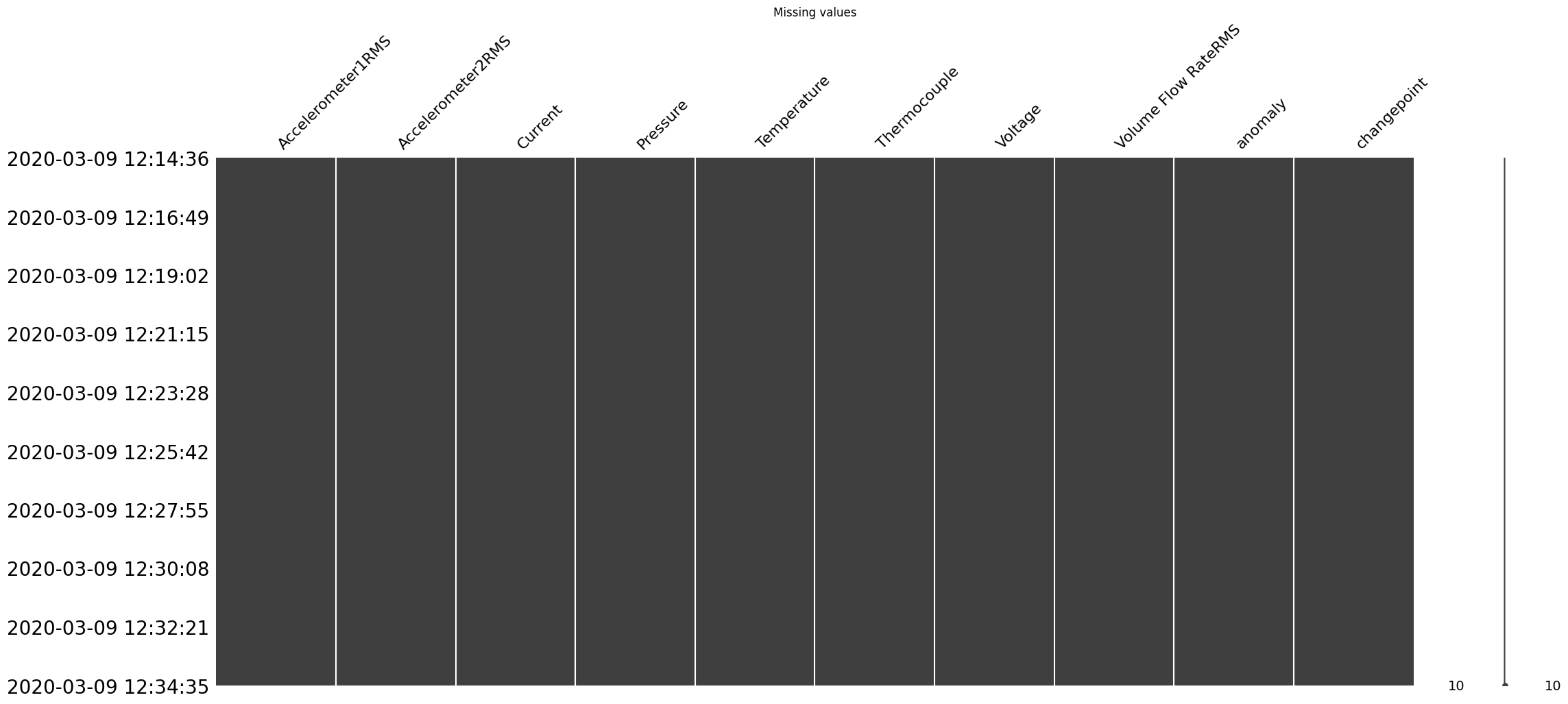
After running this code, a plot of missing values in your DataFrame will be displayed.
Using VisualizationTimeseriesTask and VisualizationCustomTask in a Pipeline
The VisualizationTimeseriesTask and VisualizationCustomTask are a task designed for visualizing time series data. They can be used as part of a pipeline to generate interactive line plots of time series signals based on your DataFrame. Below is an example of how to use VisualizationTimeseriesTask and VisualizationCustomTask within a pipeline:
[15]:
try:
    from tsad.base.pipeline import Pipeline
    from tsad.tasks.feature_generation import FeatureGenerationTask
    from tsad.tasks.feature_selection import FeatureSelectionTask
except:
    import sys
    sys.path.append('../')
    from tsad.base.pipeline import Pipeline
    from tsad.tasks.feature_generation import FeatureGenerationTask
    from tsad.tasks.feature_selection import FeatureSelectionTask
Create a pipeline with FeatureGenerationTask, FeatureSelectionTask, VisualizationTimeseriesTask and VisualizationCustomTask
[16]:
pipeline = Pipeline([
    FeatureGenerationTask(features=features, config=None),  # You can specify a configuration for feature generation.
    FeatureSelectionTask(target=target,
                         remove_constant_features=True,
                         feature_selection_method='frommodel',
                         n_features_to_select = 10
                        ),
    VisualizationTimeseriesTask(),  # Include TimeseriesVisualizationTask in the pipeline.
    VisualizationCustomTask()
], show=True)  # Set show=True to display the visualization.
[17]:
%%time
# Fit the pipeline to your DataFrame
df_fit = pipeline.fit(df)
df_fit.shape
'Total generated features: 4332'
'Total selected features: 10'
CPU times: user 26 s, sys: 1.65 s, total: 27.6 s
Wall time: 41 s
[17]:
(1200, 20)
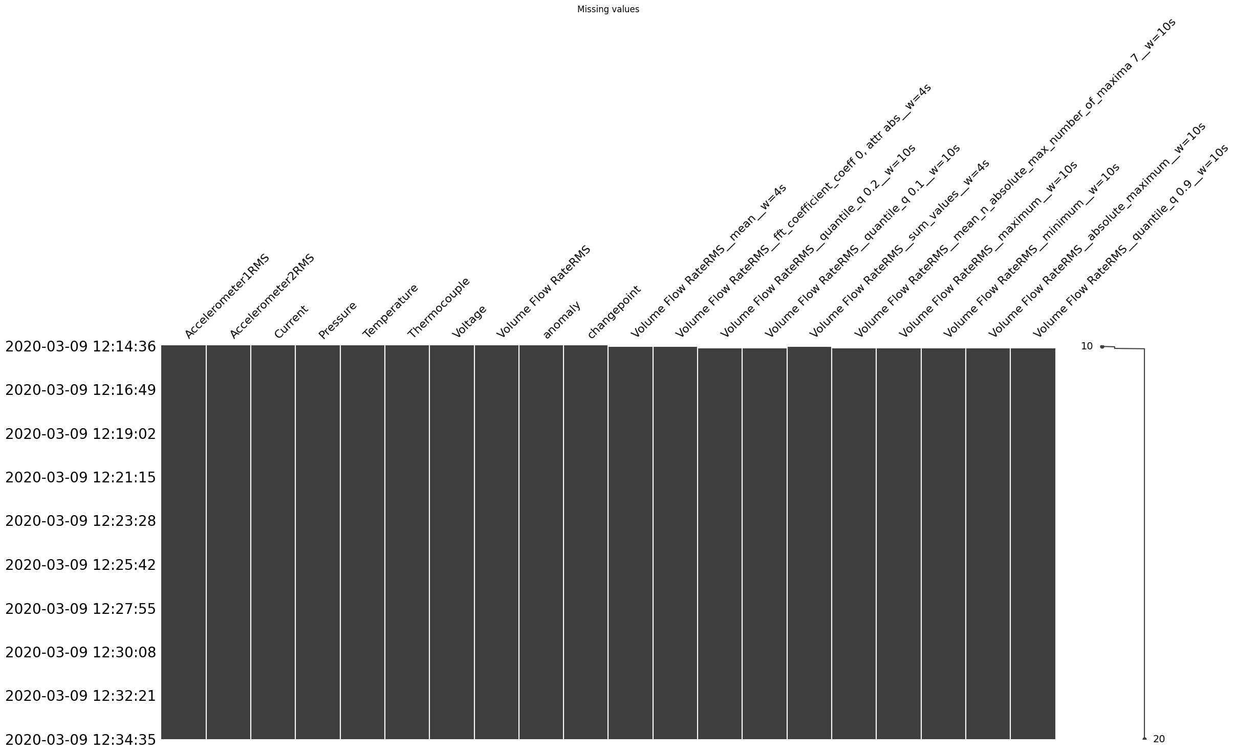
In next example, df_fit represents result of Pipeline. You can customize the features, scale, and other parameters to suit your specific needs for time series visualization.
[18]:
time_seriesvis_task = VisualizationTimeseriesTask(features= [target] + [col for col in df_fit.columns if col.startswith('Volume Flow')],
                                                  scale='minmax')
df_fit, generation_result = time_seriesvis_task.fit(df_fit)
generation_result.show()